1940s Typographic covers
May 19, 2013
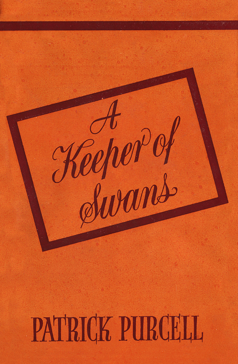
A Keeper of Swans, Patrick Purcell, Talbot Press, 1944. Design: uncredited
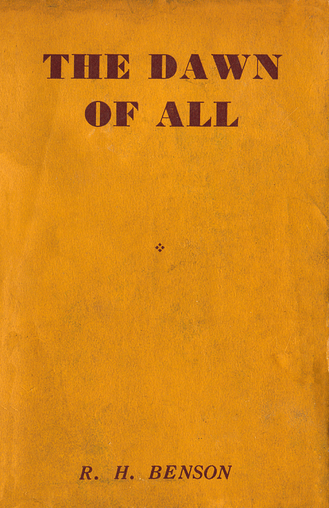
The Dawn of All, R.H. Benson, Burns Oates & Washbourne, 1945. Design: uncredited
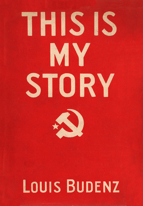
This Is My Story, Louis Budenz, Browne & Nolan, n.d. (1948). Design: uncredited
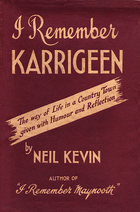
I Remember Karrigeen, Neil Kevin, Burns Oates & Washbourne, 1944. Design: uncredited
I Remember Karrigeen, (front flap), Neil Kevin, Burns Oates & Washbourne, 1944.
The above book covers from 1940s Ireland all eschew illustration in favour of typographic treatments. This was more likely to have been a cost-cutting measure than a design choice.
These covers are all from commercial publishers – Talbot Press, Browne & Nolan and Burns Oates & Washbourne – whose sights were firmly on the bottom line. Three of the four titles are essentially religious texts masquerading as secular reading and would have been considered safe bets sales-wise in the newly free Catholic Ireland.
A Keeper of Swans, the only non-religious work in the bunch doesn’t sound any more inviting. Patrick Kavanagh reviewed it in the Irish Times, 18 November 1944: “A Keeper of Swans is a grand piece of sentimentality from the Ould Sod, which should get still better notices in the USA then even Hanrahan’s Daughter.” The cover is a generic template which the Talbot Press used for numerous books during the period.
The output and production standards of these commercial publishers were generally considered poor by the arts and literary set. Liam O’Flaherty dissuaded Peadar O’Donnell from publishing his second book, Islanders, through the Talbot Press, denouncing them as “outrageously vulgar people”.
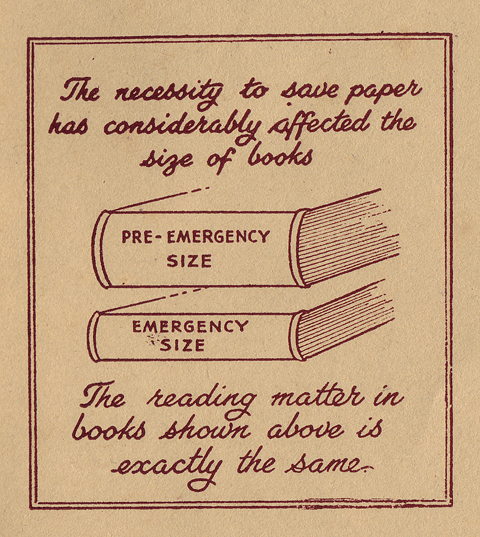
The final image is from the inside front flap of the I Remember Karrigeen jacket and refers to the rationing of paper which affected book production during the Emergency (a quaint Irish euphemism for the rather less quaint Second World War.) Judging by the book covers of the period, illustration might well have been rationed too as it was surely in short supply.
Culture File RTÉ Lyric FM
This blog was featured in a short piece for Culture File on RTÉ Lyric FM:
http://culturefilepod.tumblr.com/post/44781256034/go-ahead-and-judge-a-book-by-its-cover-with-the
Cor Klaasen Exhibition
August 30, 2010
 Walking in Wicklow, J.B. Malone, Helicon (1964). Cover design by Cor Klaasen.
 The unfortunate Fursey, Mervyn Wall, Helicon (1965). Cover design by Cor Klaasen.
 Meeting Christ, Brian Kelly, Educational Company of Ireland (1971). Cover design by Cor Klaasen.
 Thinking Through Mathematics, Gerard Beggan, Fallons (1971). Cover design by Cor Klaasen.
 Aistí agus comhrá, Pádraig Mac Concoille, Fallons. Cover design by Cor Klaasen.
 Cuir Síos Air, Fallons. Cover design by Cor Klaasen.
I included a single cover by Cor Klaasen in a previous post and commented that I hadn’t managed to track down many examples of his work despite knowing that he was both talented and prolific. Since then I’ve been contacted by Cor’s widow, Tineke, who has been generous enough to show me the comprehensive archive of his work which is in the family’s possession.
Cor Klaasen is a significant figure in the history of Irish graphic design and it is indicative of the lack of importance attached to visual culture in Ireland that such a rich body of work has faded from view. In order to begin to rectify this situation Vintage Irish Book Covers, along with the Klaasen family, are organising an exhibition of Cor’s work from the sixties and seventies which will coincide with Design Week 2010. The exhibition will consist of book cover designs for Gill & Macmillan, Fallons, Helicon, Torc and the Talbot Press, amongst others, as well as a series of striking record sleeves designed for the Mercier Press. You can see more of Cor’s work and updates on the exhibition here: www.corklaasen.com.
Cor was a natural illustrator whose style developed over his career as he experimented with different media and techniques. In the fifties he favoured pen and ink. His artist’s notebook Het is Niet Waar (1954) captures the essence of his style from this period – a wonderful mix of George Grosz grotesque and Jim Flora’s exuberant fun. I hope to add some pages from this marvelous book to the corklaasen.com site soon.
By the sixties Cor is using cut-outs and collage to achieve his lively designs. Most of the examples above use this method. The exception is The Unfortunate Fursey which is a mix of pen and ink and colour overlay in three colours. All of the rest are just two colour jobs but achieve maximum effect by imaginative use of colour mixing.
Walking in Wicklow was one of the first of Cor’s covers that I became aware of and it is still one of my favourites. The couple have been cut from black card using a swivel blade. No mean feat considering the original cutouts are reproduced same size on the book cover.
Karl Uhlemann II
August 8, 2010

Faoi Rún Go hÉirinn, Seán Ó Ciardhuáin, FNT, 1972. Design: Karl Uhlemann

Sléibhte Mhaigh Eo, Mícheál Ó hOdhráin, FNT, 1964. Design: Karl Uhlemann

Crumbling Castle, Patricia Lavelle, Clonmore & Reynolds, 1949. Design: Karl Uhlemann

Old Celtic Romances, P.W. Joyce, Talbot Press, 1963. Design: Karl Uhlemann

An Doras Grianlasta, Lorcán Ó Treasaigh, FNT, 1983. Design: Karl Uhlemann
Since I last posted on the work of Karl Uhlemann I’ve managed to dig up some more nice examples of his work but more importantly I’m now able to fill in some biographical detail. Theo Snoddy’s very informative Dictionary of Irish Artists: 20th Century tells us that Karl Uhlemann Jnr was born in 1912. His father Karl Snr was a landscape painter born near Leipzig. I still can’t say for definite if he was born in Ireland but we do know that his father was resident in Dublin from 1915 when he first exhibited at the R.H.A. Karl Snr obviously had an influence on his son’s choice of career and the creative streak in the family continued with Karl Jnr’s son Rai. I will feature some of Rai’s work in a future post.
These examples of Karl Uhlemann’s work are from dates between the late forties and the early eighties – almost 35 years. Crumbling Castle is the earliest example and although it is uncredited, the KU in the lower left hand side and the similarity to other covers by him leave us in no doubt.
My favourite of these covers is Faoi Rún Go hÉirinn. The moonlit illustration, which raps around to the back cover, is beautifully rendered and doesn’t suffer a bit from the rough print job. An Doras Grianlasta is the least successful. The typography feels like an after thought and there has been no attempt to tie it in with the illustration. It is a good example of how design quality suffered as a result of technological ‘advances’ in the late seventies and into the eighties.
E.C. Talbot Press 1940s
April 23, 2010

I Can’t Help Laughing, John D. Sheridan, Talbot Press (1949). Cover design by E.C. (Eileen Coghlan)

Statue for a Square, Francis MacManus, Talbot Press (1945). Cover design by E.C. (Eileen Coghlan)
These two ‘forties covers from the Talbot Press are both signed E.C. After a bit of digging I was able to figure out that E.C. is Eileen Coghlan (1909-90) and thanks to Theo Snoddy’s excellent Dictionary of Irish Artists: 20th Century we have some biographical detail.
Coghlan was born in Kilbeggen, Co Westmeath and attended the Dublin Metropolitan School of Art for a short period. She spent the majority of her career working as a book illustrator, particularly children’s books and schoolbooks for Browne and Nolan, the Educational Company and later Folens.
Coughlan also illustrated/designed many covers for the the Talbot Press. Her jacket for I Can’t Help Laughing (I featured a later edition of the book in an earlier post) shows her lively drawing style which she put to good use in her children’s books. Her style has a nice cartoon feel and she contributed to Dublin Opinion as a cartoonist.
In 1944 she was living at 25 Bachelor’s Walk and won £3 from the Irish Red Cross for the design of a Tuberculosis awareness poster.
Roísín Daly
On the trail of another mystery, I now believe that Roísín Daly (the designer of the beautiful Prayers of Life cover which I posted recently) is in fact the maiden name of Roísín Hogan, the first Director of Dun Laoghaire Institute of Art, Design & Technology.


