Fergus O’Ryan covers
October 19, 2011

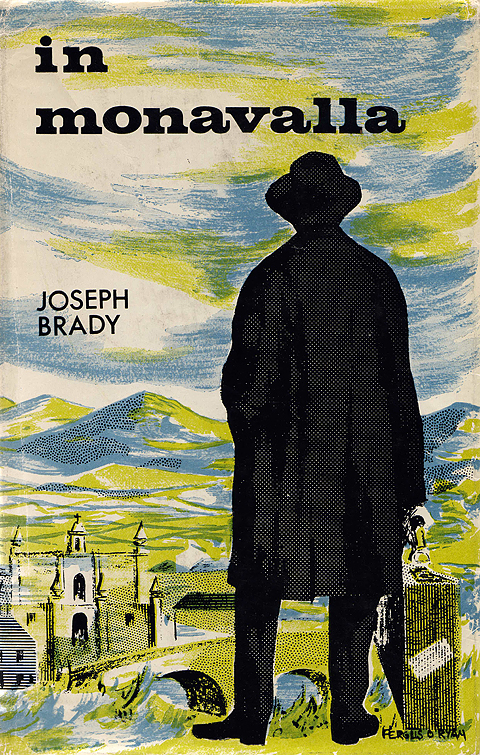
In Monavalla, Joseph Brady, Gill & Son, (1963). Cover design: Fergus O’Ryan

Legends of Killarney, Donal O’Cahill, published by author, (n.d. 8th ed.). Cover design: Fergus O’Ryan
Fergus O’Ryan RHA ANCA (1911-1989) is better known today as a painter but he spent most of his working life as ‘a professional designer and commercial artist’ as a 1949 catalogue described him.
He worked with McEvoy’s Advertising Services in Dublin in the early 1940s and in 1943 he was with the Rank Organisation working at the Theatre Royal. He became art director and remained there until it closed down in 1962, designing backdrops and scenery as well as cinema posters. From there he went on to teach lithography at the National College of Art until his retirement in 1976.
His paintings, though well executed, are quite anodyne and hark back to Impressionism. What little I’ve seen of his commercial and print work is much more interesting. I would quite happily have a print of the In Monavalla cover on my wall. The character on the cover looks like the Man in the Gray Flannel Suit although I’m not sure if that was the intention.
63 pieces of O’Ryan’s commercial work sold as part of a lot of ’60s and ’70s Irish Sweepstakes advertising art in 2005.
Dublin: The General Post Office
June 6, 2010
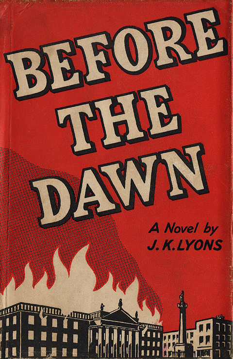
Before the Dawn, J.K. Lyons, Gill & Son (1946). Cover design: uncredited
Saoirse Gan Só, Seán De Fréine, FNT (1960). Cover design: uncredited
The General Post Office (GPO) has become an icon of the Irish state since its central role in the Easter Rising. Two different aspects of this icon are emphasised on the above covers and, although both really appeal to me aesthetically, neither cover is a good representation of the books’ contents.
In the first, Before the Dawn, the burning GPO is an heroic national symbol. According to the blurb, the story is ‘an Irish love romance’ set during the build-up to the Easter Rising of 1916. The central character is won over ‘from indifference to enthusiasm for the cause of Irish Freedom’. Despite the dynamic cover the novel is a lightweight affair.
Gone is any heroicism from the symbol of the GPO on the front of Saoirse Gan Só. Here the building, now topped with the Tricolour, represents the authority of the State. Unfortunately, the overall feel of the cover is quite upbeat in both colour and illustration style. You may be at a loss as to the content of the book if you don’t understand the title (No Respite) or miss the downcast heads of the departing emigrants in the bottom panel. I love the top left vignette of Desmond Fitzgerald’s Dublin Airport – in just a few lines the character of the building is captured along with the tail of an Aer Lingus Douglas DC-3 plane.


