Catholic Truth Society – Vintage Values book & exhibition
November 6, 2013
 The Young Lady says “NO”!, Rev. Wm. P. O’Keeffe C.M., Catholic Truth Society of Ireland (1946). Cover design: John Henry. Courtesy of Veritas/Vintage Values.

What to do on a Date?, Rev. Daniel A. Lord S.J., Catholic Truth Society of Ireland (1958). Cover design: Martin Collins. Courtesy of Veritas/Vintage Values.
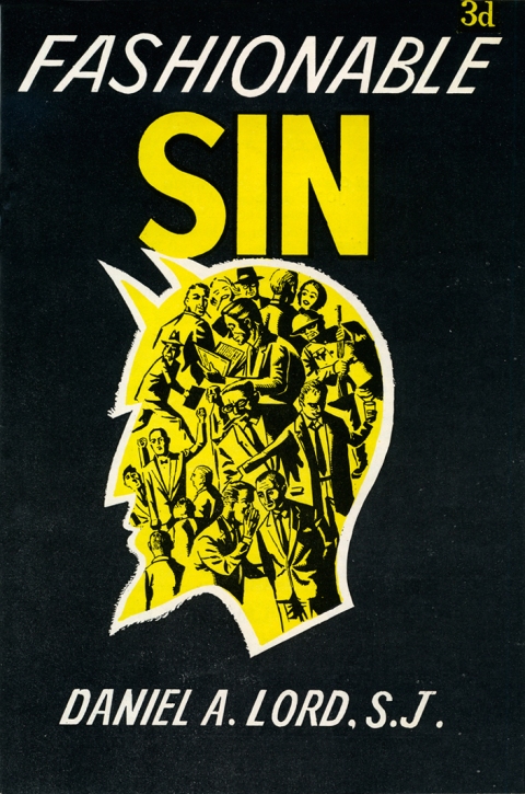
Fashionable Sin, Rev. Daniel A. Lord S.J., Catholic Truth Society of Ireland (1957). Cover design: Martin Collins. Courtesy of Veritas/Vintage Values.

Divorce is a Disease, Rev. Martin J. Scott S.J., Catholic Truth Society of Ireland (1944). Cover design: John Henry. Courtesy of Veritas/Vintage Values.

Suggestions om saying the Rosary Without Distractions, Sister M. Emmanuel O.S.B., Catholic Truth Society of Ireland (1944). Cover design: John Henry. Courtesy of Veritas/Vintage Values.

A Guide to Fortune Telling, Rev. Daniel A. Lord S.J., Catholic Truth Society of Ireland (1943). Cover design: Sean Best. Courtesy of Veritas/Vintage Values.
Earlier this year I wrote about the cover art of Catholic Truth Society of Ireland pamphlets. At the time I had very little in the way of facts to go on and the piece was essentially guess work. Shortly after writing the post I was contacted by Lir Mac Cárthaigh, Art Director at Veritas, who informed me that they hold a full archive of the pamphlet covers and have details of the cover artists behind each of the designs! He told me that my conjecture about the artwork was correct and that they were in fact all designed by Irish designers. Also, the pamphlets were reprinted many times over the years so the reprint dates were often many years later than the original artwork was completed. Lir understood the importance of the archive and had been working for some time to bring it back to public view. He invited me to meet with him and view the collection, which I was delighted to do.
The archive consists of a couple of large filing cabinets which are jam-packed with dusty envelopes, each containing an original CTS pamphlet and a card detailing the cover artist, fee paid, print-run and subsequent reprints. The collection is so vast that it was only possible to view a small random sampling of the covers. The earlier covers, from before the 1920s, have generic typographic covers but designs from the twenties on incorporate illustration and as you move through the years the artwork gets more and more bright and vibrant.
While the archive contains work by artists who are reasonably well known, including George Monks, Karl Uhlemann, Ailbhe Ó Monacháin (Alfred Monahan) and numerous examples by George Altendorf, I was most excited by the work of a number of complete unknowns – John Henry, Martin Collins and Sean Best. These three artists worked in a style heavily influenced by advertising spot illustration and showcard art. Their work displays a confidence and skill which really makes it sparkle. For a long time this sort of design was dismissed as low-brow or purely vernacular but in more recent times there has been a growing appreciation of the craft involved in making this work.
Unfortunately, we have scant details of these three artists. John Henry was a student at the Dublin Metropolitan School of Art in the early 1920s and would have studied along side George Altendorf under Austin Molloy. Seán Best designed the cover of the official Eucharistic Congress programme (1932). A Martin Collins held a solo exhibition of paintings in Lad Lane Gallery in 1978 and was also working as a ‘visualiser’ with the Peter Owens advertising agency in the early 1980s but it’s impossible to say if either or both are the same artist who created these pamphlet covers.
Since our meeting, Lir Mac Cárthaigh has been busy sifting through the archive and assembling a book and exhibition which showcase some of the most interesting examples from the collection. The exhibition, entitled Vintage Values, runs at the National Print Museum from the 4th until the 24th November and the Vintage Values book, which I had the pleasure of writing the introduction for, will be launched on the 19th of November at the Print Museum. A number of poster prints and postcards of the designs are available from the Vintage Values website.
Dracula – 1933 cover by Austin Molloy
October 21, 2013

Dracula, Bram Stoker, translated into Irish by Seán Ó Cuirrín, Oifig Díolta Foillseacháin Rialtais, 1933. Design: AóM (Austin Molloy). Courtesy of John Moore/Little Museum of Dublin
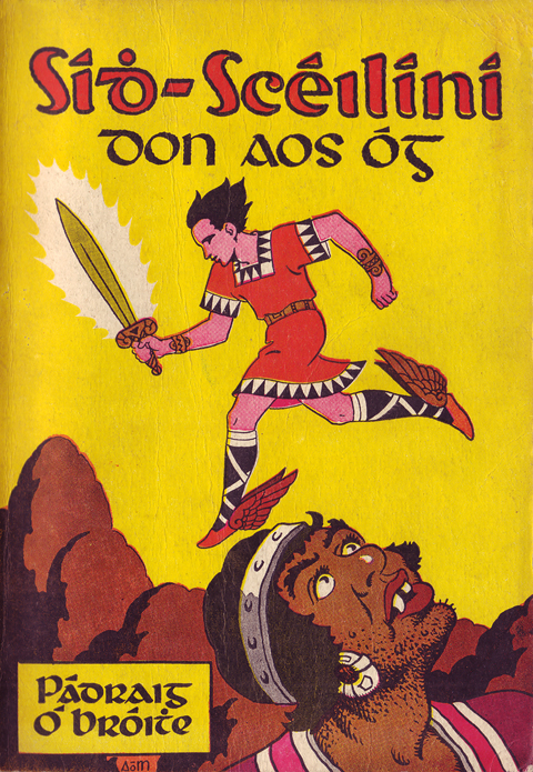
Sídh-Scéilíní don aos óg (Fairy Stories for the Younger Generation), Pádraig Ó Bróithe, Oifig An tSoláthair, 1939 (2nd ed. 1946). Design: AóM (Austin Molloy)
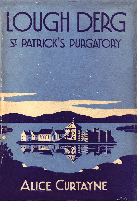
Lough Derg, Alice Curtayne, Burns, Oates & Washbourne, 1944. Design: AóM (Austin Molloy)
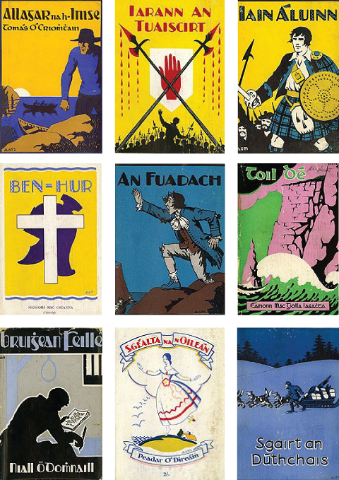
Various covers designed by AóM (Austin Molloy) for Oifig An tSoláthair/Oifig Díolta Foillseacháin Rialtais from: Boston College University Libraries: Free State Art: Judging Ireland by its Book Covers

Left: Cogadh na Reann (War of the Worlds), H.G. Wells, Oifig Diolta Foilseachain Rialtais, 1934. Design: AóM (Austin Molloy). Right: Cú na mBaskerville (Hound of the Baskervilles), Arthur Conan Doyle, Oifig Diolta Foilseachain Rialtais, 1934. Design: V.P. (Victor Penney)
I am delighted to share this little-seen cover for the 1933 Irish language edition of Bram Stocker’s Dracula. The deceptively simple design is by Austin Molloy (1886–1961) who signed his work AóM (Austin Ó Maolaoid). The three-colour design employs two shades of green and a yellow, a colour choice which we wouldn’t associate with the gothic or horror genres today yet is quite effective here. This fascinating chronology of Dracula covers shows that Molloy’s work is among the earliest illustrated covers and that the iconography we now associate with the book was in its infancy when he tackled the commission. There is no sign of any visual influence from Nosferatu (1922) or the first official film adaptation (1931) in Molloy’s design.
Austin Molloy was born in Castleknock, Dublin in 1886. He attended the Dublin Metropolitan School of Art between 1909 and 1916 where he befriended fellow student Harry Clarke. The two made a sketching trip together to the Aran Islands in 1909. As a student, Molloy contributed cartoons to Arthur Griffith’s Sinn Féin newspaper for 1 shilling and 6 pence per week. His cartoon work also appeared early on in Charles E. Kelly’s Dublin Opinion which began publication in 1922. In 1923 he took over teaching Harry Clarke’s illustration and layout course at the Metropolitan School of Art. Between them they taught a generation of talented designers who made their mark in the ‘thirties and ‘forties. These included George Altendorf, Olive Cunningham, Richard King, Victor Penney and John Henry.
Molloy was a prolific book cover artist and above is a small selection of his work. His main client was An Gúm (The Scheme) which was a government initiative started in 1925 to publish books in Irish. Under the Oifig Díolta Foillseacháin Rialtais (Government Publications Office) and Oifig An tSoláthair (Stationary Office) imprints, An Gúm published numerous titles. These included translations of works by English, American and European writers as well as original Irish books. It is interesting to see Molloy employ the same art deco-style lettering on the covers of Ben Hur, Iain Áluinn and Dracula.
Molloy also designed the cover for the Irish translation of another popular classic – H.G. Wells’ War of the Worlds (Cogadh na Reann) while Arthur Conan Doyle’s Hound of the Baskervilles (Cú na mBaskerville) is graced by cover art from Victor Penney, one of Molloy’s more talented students from the Metropolitan School.
It is great to see Dracula’s Dublin-born creator being celebrated in the form of the Bram Stoker Festival. As part of this year’s festival the Irish language first edition of Dracula (above), along with other key foreign first editions, will be on view at the Little Museum of Dublin from the 25th of October until the 25th of November in an exhibit titled “Dracula: Life after Death”.
Little Magazines: Literary Periodicals 1950 – 1970
July 10, 2013
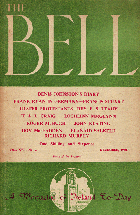
The Bell, Vol. XVI No. 3, December 1950. Design: uncredited
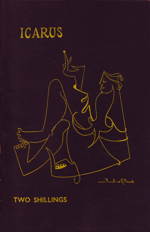 Icarus, Vol. 5 No. 17, November 1955. Design: Pauline Bewick
 The Kilkenny Magazine, No. 2, Autumn 1960. Design: Christopher Fay
 Poetry Ireland, No. 1, Autumn 1962. Design: uncredited (Ruth Brandt)
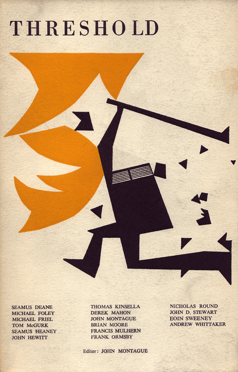 Threshold, No. 23, Summer 1970. Design: Colin Middleton
Literary magazines held a special place in the cultural life of mid-century Ireland. Although print-runs were low, their impact was disproportionate and they managed to reflect a more varied and complex Ireland then the mainstream media. The five examples above all follow a set format – octavo in size, each has a mono interior with a 2-colour cover on heavy uncoated card.
The Bell is the best know of the magazines here. The first issue appeared in 1940 under the editorship of Seán Ó Faoláin. It managed to continue publication throughout the ’40s, challenging the then dominant, and restrictive, notion of Irishness. The above cover from 1950 bears more then a passing resemblance to the classic Penguin covers of the period. The magazine ceased publication in 1954.
Icarus is a literary magazine published by Trinity College, Dublin. It was founded in 1950 and I believe it is still extant despite a very low profile. Iain Sinclair, Hackney historian and psycho-geographer, served as editor in the mid-sixties when he attended TCD. The arresting cover featured here is an early commercial commission by Pauline Bewick. Some simple but very effective spot illustrations in scraper-board, also by Bewick, appear in the interior. The cover art has generally moved with the times but hasn’t always been as successful as this example. Tim Booth of Dr Strangely Strange fame delivered a comic book inspired cover in 1965 and Tom Doorley, food critic, supplied a decent design for the Trinity Term 1982 issue.
The Kilkenny Magazine lasted 18 issues from 1960 to 1970. Issue no. 2, Autumn 1960 (above) includes a linocut by Christopher Fay on the cover. I can find no further artistic endeavors by the elusive Fay. The Spring 1963 issue included the first publication of Seamus Heaney’s Mid-Term Break.
Poetry Ireland has appeared in a number of different formats since it’s initial publication under founding editor David Marcus in 1948. This original iteration lasted 19 issues until 1952. For a few more years it ran as a supplement to Irish Writing, petering out in 1955. In 1962 it was resurrected as a magazine in its own right under the editorship of John Jordan. This new version lasted 8 issues until 1968 and was printed and published by the Dolmen Press.
The cover above is the first one under Dolmen’s watchful eye and is a triumph of earthy elegance, combining the unsophisticated beauty of letterpress with refined and understated layout and typography. The “fabulous bird”, as John Jordan referred to it, is the work of Ruth Brandt (1936-89). Brandt was the daughter of Muriel Brandt and married fellow artist Michael Kane in 1961. She provided illustrations and lettering for a number of Dolmen books but I can’t tell if she is responsible for the wonderfully blocky and not quite uncial lettering of the Poetry Ireland masthead.
Threshold was a publication of Belfast’s Lyric Players Theater. The first issue emerged in 1957 with Mary O’Malley as editor and it continued irregularly until 1990. The example shown is the 1970 “Northern Crisis” issue and sports striking cover art by Colin Middleton (1910-83).
It is probably no surprise that literary magazines looked to artists rather than designers for their cover art. There is certainly a discernible aesthetic sensibility running through these disparate publications.
1940s Typographic covers
May 19, 2013
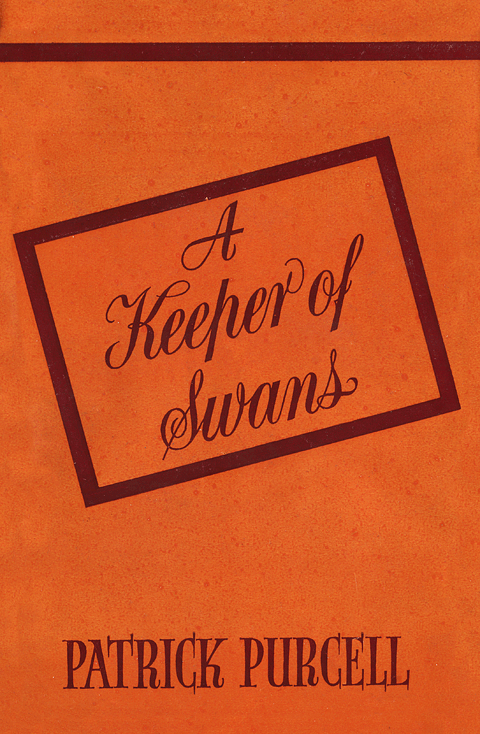
A Keeper of Swans, Patrick Purcell, Talbot Press, 1944. Design: uncredited
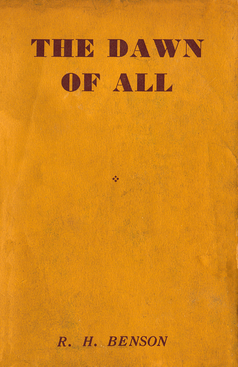
The Dawn of All, R.H. Benson, Burns Oates & Washbourne, 1945. Design: uncredited
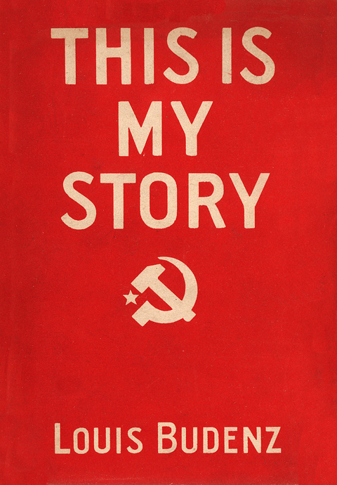
This Is My Story, Louis Budenz, Browne & Nolan, n.d. (1948). Design: uncredited
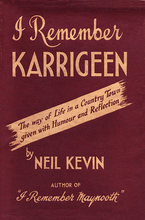
I Remember Karrigeen, Neil Kevin, Burns Oates & Washbourne, 1944. Design: uncredited
I Remember Karrigeen, (front flap), Neil Kevin, Burns Oates & Washbourne, 1944.
The above book covers from 1940s Ireland all eschew illustration in favour of typographic treatments. This was more likely to have been a cost-cutting measure than a design choice.
These covers are all from commercial publishers – Talbot Press, Browne & Nolan and Burns Oates & Washbourne – whose sights were firmly on the bottom line. Three of the four titles are essentially religious texts masquerading as secular reading and would have been considered safe bets sales-wise in the newly free Catholic Ireland.
A Keeper of Swans, the only non-religious work in the bunch doesn’t sound any more inviting. Patrick Kavanagh reviewed it in the Irish Times, 18 November 1944: “A Keeper of Swans is a grand piece of sentimentality from the Ould Sod, which should get still better notices in the USA then even Hanrahan’s Daughter.” The cover is a generic template which the Talbot Press used for numerous books during the period.
The output and production standards of these commercial publishers were generally considered poor by the arts and literary set. Liam O’Flaherty dissuaded Peadar O’Donnell from publishing his second book, Islanders, through the Talbot Press, denouncing them as “outrageously vulgar people”.
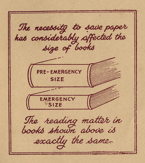
The final image is from the inside front flap of the I Remember Karrigeen jacket and refers to the rationing of paper which affected book production during the Emergency (a quaint Irish euphemism for the rather less quaint Second World War.) Judging by the book covers of the period, illustration might well have been rationed too as it was surely in short supply.
Culture File RTÉ Lyric FM
This blog was featured in a short piece for Culture File on RTÉ Lyric FM:
http://culturefilepod.tumblr.com/post/44781256034/go-ahead-and-judge-a-book-by-its-cover-with-the
Catholic Truth Society of Ireland – booklet covers
March 15, 2013

“Don’t Swear Like That!”, Rev. Daniel A. Lord S.J., Catholic Truth Society of Ireland (1950). Cover design: unknown
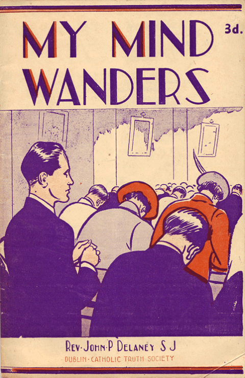
My Mind Wanders, Rev. John P. Delaney S.J., Catholic Truth Society of Ireland (1961). Cover design: unknown
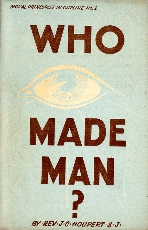
Who Made Man?, Rev. J.C. Houpert S.J., Catholic Truth Society of Ireland (1952). Cover design: unknown. From Lux Occulta

How to Make an Act of Perfect Contrition, Rev. L. Dowling S.J., Catholic Truth Society of Ireland (1948). Cover design: unknown. From Lux Occulta
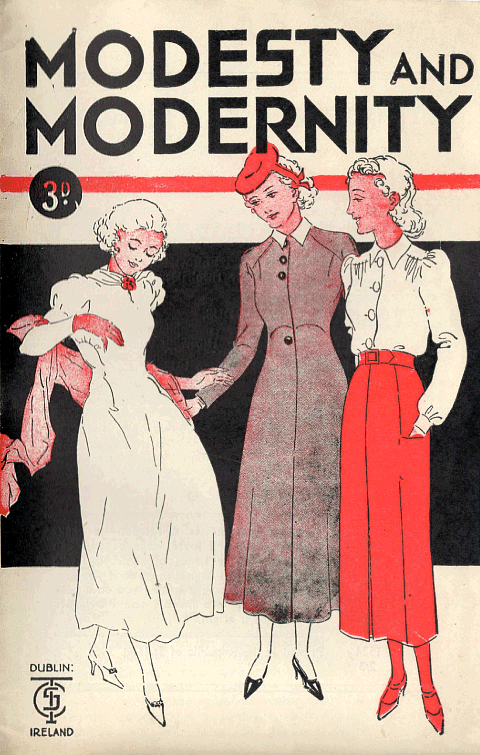
Modesty and Modernity, Catholic Truth Society of Ireland (1951). Cover design: unknown. From Lux Occulta
I’ve been aware of the Catholic Truth Society of Ireland booklet covers for some time but was reluctant to post examples as I wasn’t able to establish whether they were designed in Ireland or elsewhere. Many of the texts were originally published in the USA and further afield – Who Made Man? was first published by the Catholic Truth Society of India! Given the various origins of the material I wondered if the covers were merely reprints or adaptations of the original covers and therefore not truly Irish cover designs.
I picked up a few more examples at the recent Trinity booksale and my curiosity was piqued again. Since my last efforts at research a new resource has come online – Lux Occulta – Catholic Pamphlets. Having looked at the Irish booklets on the site, I have established that all of the covers with an artwork credit are by Irish artists, including the ever prolific Karl Uhlemann, Alfred E. Kerr, G. A. (George Altendorf), P. J. Quinn and J. Mulhern (possibly artist John Mulhern). Since none of the signed pieces are by non-Irish illustrators, I feel it is reasonable to believe that the artwork for the booklet covers was prepared in Ireland regardless of whether the contents were being published for the first time or reprints of previous texts.
The Catholic Truth Society of Ireland (later Veritas) was founded in 1899. Its aim is best summed up by this wording that appeared in many of the pamphlets:
This booklet has a Mission – to make God known and loved. Maybe you can place it in the hands of somebody who needs it. Don’t neglect to do so if you can. If you can’t, leave it behind you on a park seat, in a ‘bus, in a theatre, and Providence will guide it aright.
It seems from this that urbanites, in danger from the evils of modern living, were the target audience. The covers above give a good idea of the styles thought best to appeal to the city dweller in need of Truth. There is quite a nod to advertising and showcard design of the era with a hint of modern/deco styling although the crude printing mitigates against producing the desired slick effect. While these publications now appear quaint and often hilarious it is worth remembering that they formed part of an insidious culture which held sway in Ireland through much of the 20th century.
The dates quoted above aren’t, as far as I can discern, the original publication dates but rather the date of that particular printing. Many of the designs are in styles which would have been anachronistic by the time of the stated print date. While My Mind Wanders is dated 1961 another booklet in the series titled My Mind STILL Wanders has a date of 1945 which suggests that the original publication date of the former must have been earlier than 1945.
Reading Pictures at the RHA
After all of that, if ye still seek the Truth, I will be speaking about vintage Irish bookcover design this Saturday, 16th March at 3pm in the RHA. The talk is part of Reading Pictures – A celebration of Irish children’s books and illustration, organised by Irish Design Shop in collaboration with the RHA and Children’s Books Ireland. Admission is free and all are welcome.
Máirtín DeFuireastail
January 27, 2013

An Buama Deiridh, Deasún Breatnach, FNT (1962). Cover design: Máirtín DeFuireastail

Seal Thall, Seal Abhus, Deasún Breatnach, Oifig An tSoltáthair (1973). Cover design: Máirtín DeFuireastail

An tÁr sa Mhainistir, S.E. Ó Cearbhaill, Oifig An tSoltáthair (1972). Cover design: Máirtín DeFuireastail

An tÁr sa Mhainistir (back cover), S.E. Ó Cearbhaill, Oifig An tSoltáthair (1972). Cover design: Máirtín DeFuireastail
Máirtín DeFuireastail’s cover design for An Buama Deiridh (The Last Bomb) is a wonderful piece of comic book pop art. On first look it may appear to be yet another tired Lichtenstein appropriation yet, amazingly, DeFuireastail created this in 1962, a full year before Lichtenstein painted Whaam! The cover crackles with Cold War nuclear paranoia – an imaginary metropolis under threat from some diabolical danger.
The comic book influence runs through the other examples of Máirtín DeFuireastail’s art. There is a lovely crispness to his line work. The streetscape in an orange band on the back cover of An tÁr sa Mhainistir is particularly pleasing. It reminds me of the illustrations on the cover of Saoirse Gan Só which I wrote about previously. I have a strong feeling that it is also the work of DeFuireastail but it is no credit on the book.
DeFuireastail produced illustrations and cover designs for books from at least 1956 until sometime in the mid-seventies, other than that I have no biographical details for this talented designer.
Typography Ireland
I will be speaking about typography in Irish book covers at the next Typography Ireland seminar this Friday 1st of February at 2.30pm. Paul Freeney will also be speaking about the work of his father, sign painter, Kevin Freeney. The seminar takes place in the GRADCAM seminar room, John’s Lane West, Dublin 8. The building is a former primary school and the GRADCAM seminar room is on the top floor.
Marathon Irish Pop-up Exhibition – London 6 – 8 September
August 28, 2012
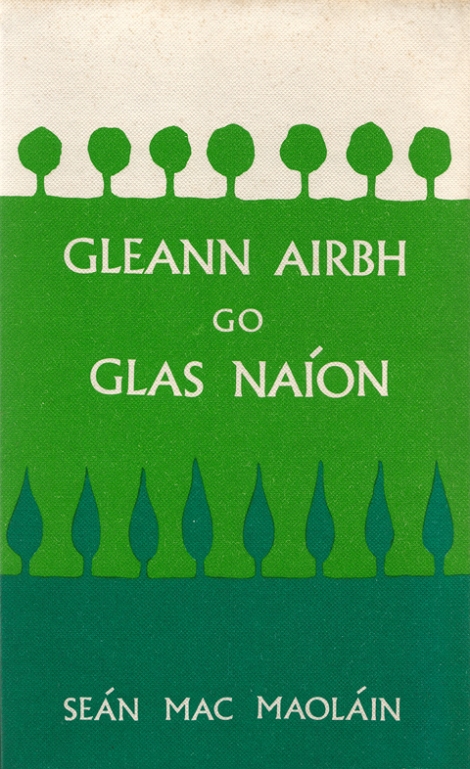
Gleann Airbh go Glas Naíon, Seán MacMaoláin, Oifig an tSoláthair (1969). Cover design: unknown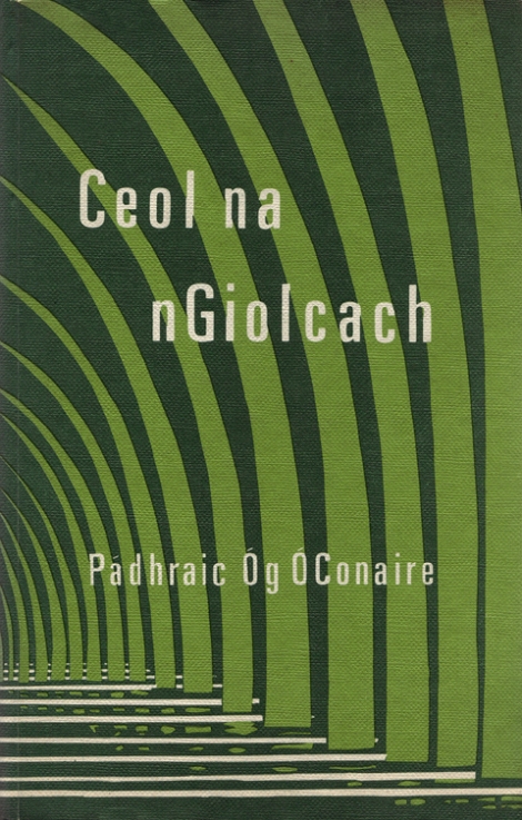
Ceol na nGiolcach, Pádhraic Óg Ó Conaire, Oifig an tSoláthair (1968, 1976 reprint). Cover design: W.G. Spencer
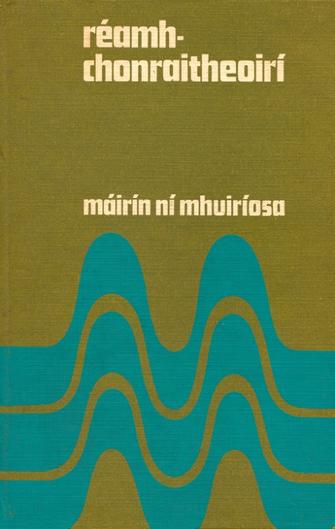
Réamhchonraitheoirí, Máirín ní Mhuiríosa, Clódhanna Teo. (1968). Cover design: unknown
![]()
Vintage Irish Book Covers is delighted to be taking part in Marathon Irish, a celebration of Irish Culture, which is taking place in London until the 15th of September. I will be packing as many Irish books with beautiful jacket and cover artwork and bringing them to the Dialogue Culture Space in Vyner Street, East London for a pop-up exhibition from Thursday 6 to Saturday 8 September.
I’ve been looking for an excuse to post the three covers above for some time. All three are from the late sixties, employ two shades of green in varying degrees of abstraction and are printed paper cases. But other than that, I’m afraid, I know little about them except that their simplicity really appeals to me.
W.G. Spencer, who designed the abstracted reeds on a river bank for the cover of Ceol na nGiolcach, may be the architect of the same name who contributed sketches of old Dublin buildings to The Irish Builder from 1963-4.
Karl Uhlemann – FNT covers
December 14, 2011

Meas na Filíochta, Odhrán Ó Duáin OFM, FNT, (1968). Cover design: Karl Uhlemann

Sladmhargadh, Donach de Róiste, FNT, (1968). Cover design: Karl Uhlemann

Ó Rabharta Go Mallmhuir, Seán ‘ac Fhionnlaoich, FNT, (1975). Cover design: Karl Uhlemann

Fir Chlaímh, Seán Ó Mulláin, FNT, (1976). Cover design: Karl Uhlemann

Slán Leis an gComhluadar, Mícheál Ó hOdhráin, FNT, (1961). Cover design: Karl Uhlemann

Feoil an Gheimhridh, Colm Ó Baoill, FNT, (1980). Cover design: Karl Uhlemann

Is Glas na Cnoic, Seán ‘ac Fhionnlaoich, FNT, (1977). Cover design: Karl Uhlemann
Foilseacháin Náisiúnta Teoranta (FNT) (National Publications Limited) published Irish language books until 1988 and, despite the very formal moniker, it wasn’t a State run publisher but in fact a commercial enterprise (although it did receive some subsidies over the years). The company was incorporated in Westport in 1947 when it bought the printing works of the Mayo News. It continued to publish that paper but it’s main focus was the Irish language newspaper Inniu which had been founded by Ciarán Ó Nualláin and Proinsias Mac an Bheatha’s Glúin na Bua (a breakway from Conradh na Gaeilge) in 1943. Ciarán Ó Nualláin was Flann O’Brien’ brother and, more importantly from our point of view, also the brother of Mícheál Ó Nualláin whose design work we have featured previously.
FNT’s book publishing activity started as a sideline to the newspaper business but the number of titles grew steadily over the years. Karl Uhlemann was FNT’s main cover artist for a considerable portion of its existence. Above are examples of his work for them over a twenty year period from 1961 to 1980. It is interesting to see how his skills developed with time, particularly when comparing his treatment of the Traveller’s caravans in the covers from 1961, Slán Leis an gComhluadar, and 1975, Fir Chlaímh.
My favourites are Meas na Filíochta, with its Japanese feel, and the pop art sci-fi explosion of Sladmhargadh. You can see more of Mr Uhlemann’s work and what little I’ve been able to ascertain of his biography in these two earlier posts.
Fergus O’Ryan covers
October 19, 2011

In Monavalla, Joseph Brady, Gill & Son, (1963). Cover design: Fergus O’Ryan

Legends of Killarney, Donal O’Cahill, published by author, (n.d. 8th ed.). Cover design: Fergus O’Ryan
Fergus O’Ryan RHA ANCA (1911-1989) is better known today as a painter but he spent most of his working life as ‘a professional designer and commercial artist’ as a 1949 catalogue described him.
He worked with McEvoy’s Advertising Services in Dublin in the early 1940s and in 1943 he was with the Rank Organisation working at the Theatre Royal. He became art director and remained there until it closed down in 1962, designing backdrops and scenery as well as cinema posters. From there he went on to teach lithography at the National College of Art until his retirement in 1976.
His paintings, though well executed, are quite anodyne and hark back to Impressionism. What little I’ve seen of his commercial and print work is much more interesting. I would quite happily have a print of the In Monavalla cover on my wall. The character on the cover looks like the Man in the Gray Flannel Suit although I’m not sure if that was the intention.
63 pieces of O’Ryan’s commercial work sold as part of a lot of ’60s and ’70s Irish Sweepstakes advertising art in 2005.
Anvil covers by Joe O’Byrne, 1965
October 8, 2011

Freemantle Mission, Seán Ó Lúing, Anvil Books, (1965). Cover design: Joe O’Byrne

The mystery of the Casement ship, Captain Karl Spindler, Anvil Books, (1965). Cover design: Joe O’Byrne

The Clanking of Chains, Brinsley MacNamara, Anvil Books, (1965). Cover design: Joe O’Byrne
Above are three covers for Anvil Books designed by Joe O’Byrne in 1965. The post-nominal initials MIAPI after his credit for the Fremantle cover were the vital clue to who he might be. A member of the Institute of Advertising Practitioners in Ireland, O’Byrne was working for O’Kennedy Brindley when he designed these covers, on the side, for Anvil. He later went on to found his own advertising agency, O’Byrne Associates, which gave Brennan’s Bread their distinctive yellow and red wrappers and the slogan “Today’s Bread Today”.
Anvil Books specialised in Irish history with a heavy leaning to Republican themes. The Clanking of Chains stands out for being a novel. O’Byrnes’ design echos MacNamara’s most infamous work, Valley of the Squinting Windows, placing a figure in a window as the only illustration in a predominately typographic treatment. To my mind, the Fremantle Mission is the most striking cover of the three. The orange of the sun really jumps out from the rust background.


