Little Magazines: Literary Periodicals 1950 – 1970
July 10, 2013
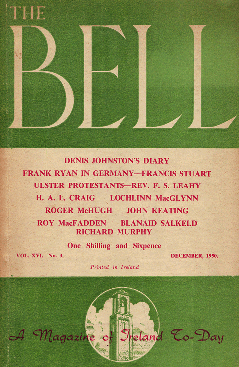
The Bell, Vol. XVI No. 3, December 1950. Design: uncredited
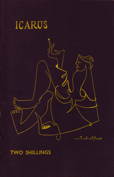 Icarus, Vol. 5 No. 17, November 1955. Design: Pauline Bewick
 The Kilkenny Magazine, No. 2, Autumn 1960. Design: Christopher Fay
 Poetry Ireland, No. 1, Autumn 1962. Design: uncredited (Ruth Brandt)
 Threshold, No. 23, Summer 1970. Design: Colin Middleton
Literary magazines held a special place in the cultural life of mid-century Ireland. Although print-runs were low, their impact was disproportionate and they managed to reflect a more varied and complex Ireland then the mainstream media. The five examples above all follow a set format – octavo in size, each has a mono interior with a 2-colour cover on heavy uncoated card.
The Bell is the best know of the magazines here. The first issue appeared in 1940 under the editorship of Seán Ó Faoláin. It managed to continue publication throughout the ’40s, challenging the then dominant, and restrictive, notion of Irishness. The above cover from 1950 bears more then a passing resemblance to the classic Penguin covers of the period. The magazine ceased publication in 1954.
Icarus is a literary magazine published by Trinity College, Dublin. It was founded in 1950 and I believe it is still extant despite a very low profile. Iain Sinclair, Hackney historian and psycho-geographer, served as editor in the mid-sixties when he attended TCD. The arresting cover featured here is an early commercial commission by Pauline Bewick. Some simple but very effective spot illustrations in scraper-board, also by Bewick, appear in the interior. The cover art has generally moved with the times but hasn’t always been as successful as this example. Tim Booth of Dr Strangely Strange fame delivered a comic book inspired cover in 1965 and Tom Doorley, food critic, supplied a decent design for the Trinity Term 1982 issue.
The Kilkenny Magazine lasted 18 issues from 1960 to 1970. Issue no. 2, Autumn 1960 (above) includes a linocut by Christopher Fay on the cover. I can find no further artistic endeavors by the elusive Fay. The Spring 1963 issue included the first publication of Seamus Heaney’s Mid-Term Break.
Poetry Ireland has appeared in a number of different formats since it’s initial publication under founding editor David Marcus in 1948. This original iteration lasted 19 issues until 1952. For a few more years it ran as a supplement to Irish Writing, petering out in 1955. In 1962 it was resurrected as a magazine in its own right under the editorship of John Jordan. This new version lasted 8 issues until 1968 and was printed and published by the Dolmen Press.
The cover above is the first one under Dolmen’s watchful eye and is a triumph of earthy elegance, combining the unsophisticated beauty of letterpress with refined and understated layout and typography. The “fabulous bird”, as John Jordan referred to it, is the work of Ruth Brandt (1936-89). Brandt was the daughter of Muriel Brandt and married fellow artist Michael Kane in 1961. She provided illustrations and lettering for a number of Dolmen books but I can’t tell if she is responsible for the wonderfully blocky and not quite uncial lettering of the Poetry Ireland masthead.
Threshold was a publication of Belfast’s Lyric Players Theater. The first issue emerged in 1957 with Mary O’Malley as editor and it continued irregularly until 1990. The example shown is the 1970 “Northern Crisis” issue and sports striking cover art by Colin Middleton (1910-83).
It is probably no surprise that literary magazines looked to artists rather than designers for their cover art. There is certainly a discernible aesthetic sensibility running through these disparate publications.
Marathon Irish Pop-up Exhibition – London 6 – 8 September
August 28, 2012
Gleann Airbh go Glas Naíon, Seán MacMaoláin, Oifig an tSoláthair (1969). Cover design: unknown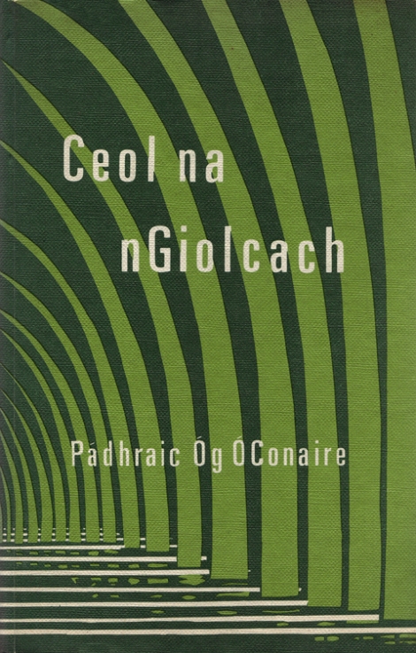
Ceol na nGiolcach, Pádhraic Óg Ó Conaire, Oifig an tSoláthair (1968, 1976 reprint). Cover design: W.G. Spencer
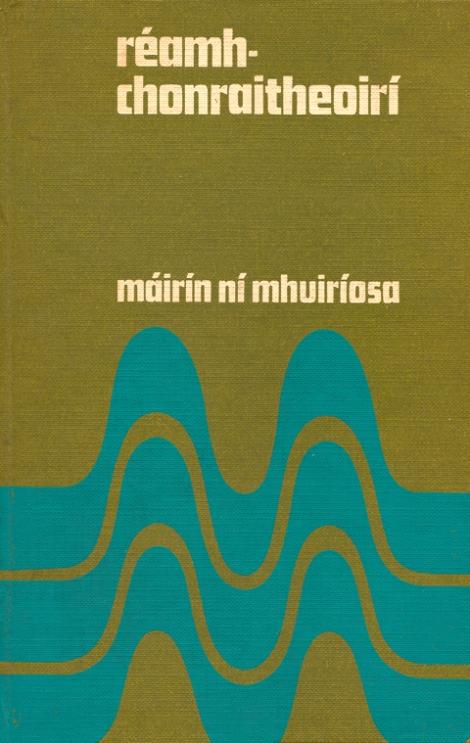
Réamhchonraitheoirí, Máirín ní Mhuiríosa, Clódhanna Teo. (1968). Cover design: unknown
![]()
Vintage Irish Book Covers is delighted to be taking part in Marathon Irish, a celebration of Irish Culture, which is taking place in London until the 15th of September. I will be packing as many Irish books with beautiful jacket and cover artwork and bringing them to the Dialogue Culture Space in Vyner Street, East London for a pop-up exhibition from Thursday 6 to Saturday 8 September.
I’ve been looking for an excuse to post the three covers above for some time. All three are from the late sixties, employ two shades of green in varying degrees of abstraction and are printed paper cases. But other than that, I’m afraid, I know little about them except that their simplicity really appeals to me.
W.G. Spencer, who designed the abstracted reeds on a river bank for the cover of Ceol na nGiolcach, may be the architect of the same name who contributed sketches of old Dublin buildings to The Irish Builder from 1963-4.
Fergus O’Ryan covers
October 19, 2011

In Monavalla, Joseph Brady, Gill & Son, (1963). Cover design: Fergus O’Ryan

Legends of Killarney, Donal O’Cahill, published by author, (n.d. 8th ed.). Cover design: Fergus O’Ryan
Fergus O’Ryan RHA ANCA (1911-1989) is better known today as a painter but he spent most of his working life as ‘a professional designer and commercial artist’ as a 1949 catalogue described him.
He worked with McEvoy’s Advertising Services in Dublin in the early 1940s and in 1943 he was with the Rank Organisation working at the Theatre Royal. He became art director and remained there until it closed down in 1962, designing backdrops and scenery as well as cinema posters. From there he went on to teach lithography at the National College of Art until his retirement in 1976.
His paintings, though well executed, are quite anodyne and hark back to Impressionism. What little I’ve seen of his commercial and print work is much more interesting. I would quite happily have a print of the In Monavalla cover on my wall. The character on the cover looks like the Man in the Gray Flannel Suit although I’m not sure if that was the intention.
63 pieces of O’Ryan’s commercial work sold as part of a lot of ’60s and ’70s Irish Sweepstakes advertising art in 2005.
Pulp fiction Irish style
June 20, 2011
 The Book of Famous Irish Spy Stories, Daniel O’Keeffe, Irish Pocket Books (1956). Design: M.G. (Michael Gallivan)
 The Book of Famous Irish Ghost Stories, Edited by Daniel O’Keeffe, Irish Pocket Books (c. 1956). Design: Michael Gallivan. (Courtesy of Larry Hynes)
 Memorable Irish Trials, Kenneth E.L. Deale, Irish Pocket Books (c. 1956). Design: Osborne. (Courtesy of Larry Hynes)
 Valentine Vaughan Omnibus, R. Thurston Hopkins, Grafton (1947). Design: unknown
 A Case Book of Ghosts, F.W. Gumley & M.P. Mahon, Northern Whig (1971). Design: unknown
 Triúr don Chómgargadh, Eoghan Ó Grádaigh, Sáirséal 7 Dill Scéalta Mistéir Uimhir 5 (1968). Design: Úna Ní MhaoilEoin

Ruathar Anall, Eoghan Ó Grádaigh, Sáirséal 7 Dill Scéalta Mistéir Uimhir 3 (1962). Design: Seoirse Mac Aodhagáin
Genre fiction has never really taken hold with Irish publishers. The zealous censorship of publications during the first few decades of the State probably played a role but it is more likely that there just isn’t a big enough population to sustain indigenous mass market paperbacks. The above examples of crime, mystery and horror covers display a charming amateurishness.
The first three are from The Mercier Press’ Irish Pocket Books imprint which operated in the mid-fifties. Michael Gallivan illustrated the first two and the third is by a mysterious ‘Osborne’. I’m afraid I can find no information on either artist. Larry Hynes kindly provided two of the examples which he included in a beautiful poster design celebrating 21 years of Charlie Byrne’s book shop in Galway.
There are 24 years between the next two examples, 1947’s Valentine Vaughan Omnibus and A Case Book of Ghosts from 1971, although the latter cover could easily be from the same period. Unfortunately, I don’t own a copy of the Valentine Vaughan book. The October 2010 issue of Book and Magazine Collector, from which the image is taken, estimates it’s value at £150-£200 sterling! The book is set in London but was published in Dublin by Grafton.
The final two covers are from Sáirséal agus Dill’s Scéalta Mistéir (Mystery Stories) series from the sixties. Úna Ní MhaoilEoin presents a rather naive rendering of a smoking pistol on the fifth book in the run, Triúr don Chómgargadh. I previously posted another of her designs for the series, An Masc. Ní MhaoilEoin wrote and illustrated a number of travel books for Sáirséal agus Dill during the sixties including An Maith Leat Spaigiti? (Do You Like Spaghetti?) (1965) and Turas Go Tuinis (Trip to Tunisia) (1969). According to Manchán Magan the Sunday Dispatch described her books as the most amusingly outspoken books ever to have appeared in the Gaelic language.
Cló Morainn Covers
August 16, 2010

Lá Dá Bhfaca Thú, Críostóir Ó Floinn, Cló Morainn, 1955. Design: Mícheál Ó Nualláin

Ag Baint Fraochán, Séamus Ó Néill, Cló Morainn, n.d. (1956). Design: Mícheál Ó Nualláin

John Devoy, Séan Ó Lúing, Cló Morainn, 1961. Design: uncredited
I believe that Cló Morainn started publishing in 1955. It is mentioned as a new venture in a review of Críostóir Ó Floinn’s Glaotar na Ridiri in The Irish Times of April 26, 1955. Sharing the page with the book reviews is Cruiskeen Lawn by Myles na Gopaleen (Brian Ó Nualláin) which seems appropriate as two of the Cló Morainn covers above were designed by Ó Nualláin’s brother – Mícheál Ó Nualláin.
These covers have a very modern feel and eschew illustration, relying instead on typography and bold blocks of colour. Lá Dá Bhfaca Thú is particularly effective. Mícheál Ó Nualláin is an accomplished painter yet I hadn’t realise that he had also designed book covers until I stumbled on these examples.
Karl Uhlemann II
August 8, 2010

Faoi Rún Go hÉirinn, Seán Ó Ciardhuáin, FNT, 1972. Design: Karl Uhlemann

Sléibhte Mhaigh Eo, Mícheál Ó hOdhráin, FNT, 1964. Design: Karl Uhlemann

Crumbling Castle, Patricia Lavelle, Clonmore & Reynolds, 1949. Design: Karl Uhlemann

Old Celtic Romances, P.W. Joyce, Talbot Press, 1963. Design: Karl Uhlemann

An Doras Grianlasta, Lorcán Ó Treasaigh, FNT, 1983. Design: Karl Uhlemann
Since I last posted on the work of Karl Uhlemann I’ve managed to dig up some more nice examples of his work but more importantly I’m now able to fill in some biographical detail. Theo Snoddy’s very informative Dictionary of Irish Artists: 20th Century tells us that Karl Uhlemann Jnr was born in 1912. His father Karl Snr was a landscape painter born near Leipzig. I still can’t say for definite if he was born in Ireland but we do know that his father was resident in Dublin from 1915 when he first exhibited at the R.H.A. Karl Snr obviously had an influence on his son’s choice of career and the creative streak in the family continued with Karl Jnr’s son Rai. I will feature some of Rai’s work in a future post.
These examples of Karl Uhlemann’s work are from dates between the late forties and the early eighties – almost 35 years. Crumbling Castle is the earliest example and although it is uncredited, the KU in the lower left hand side and the similarity to other covers by him leave us in no doubt.
My favourite of these covers is Faoi Rún Go hÉirinn. The moonlit illustration, which raps around to the back cover, is beautifully rendered and doesn’t suffer a bit from the rough print job. An Doras Grianlasta is the least successful. The typography feels like an after thought and there has been no attempt to tie it in with the illustration. It is a good example of how design quality suffered as a result of technological ‘advances’ in the late seventies and into the eighties.
Sixties Fishing Guides
July 28, 2010

Ireland Sea Angling Guide, The Inland Fisheries Trust/Bord Fáilte Éireann(1962). Cover design: uncredited

Ireland Salmon and Sea Trout Fishing, The Inland Fisheries Trust/Bord Fáilte Éireann(1962). Cover design: uncredited

Ireland Coarse Fishing, The Inland Fisheries Trust/Bord Fáilte Éireann (n.d.). Cover design: uncredited
These three fishing guides from the early sixties are aimed at international visitors rather than the home market. The illustrations of the fish have been handled quite differently on each yet they still have the feel of a set, helped by the single colour limitation and the repetition of ‘Ireland’ in Perpetua bold italics.
Sixties Mercier paperbacks
May 9, 2010

A Munster Twilight, Daniel Corkery, Mercier Press (1963). Cover design: uncredited

My Left Foot, Christy Brown, Mercier Press (1964). Cover design: John Skelton

Islanders, Peadar O’Donnell, Mercier Press (1965). Cover design: uncredited

Days of Fear, Frank Gallagher, Mercier Press (1967). Cover design: John Skelton

Self-Portrait, John B. Keane, Mercier Press (1969). Cover design: uncredited

Irish Short Stories, Seamus O’Kelly, Mercier Press (1969). Cover design: uncredited
It may seem strange that I haven’t mentioned Mercier Press covers before. This is not because I don’t deem them of merit or that I was not aware of them but quite the opposite. The Mercier Paperbacks of the 1960s were ubiquitous in Irish homes and it can be hard to see afresh something which is very familiar.
The books were designed to work as a series – always in two colour, black and a spot colour which changed from book to book. The format and back cover layout remained the same on each book. Illustration, in both pen & ink and brush & ink, was the mainstay of the covers although photography crept in as the decade came to a close. I hope that I am not overstating it to say that the Mercier Paperback covers enjoy a position in the Irish psyche akin to that of Penguin covers for British readers.
The artist John Skelton (1925-2009) was Mercier’s main cover designer – he worked as an art director and book illustrator before concentrating full-time on painting in 1975. The line work in his My Left Foot cover has a Ben Shan feel while his brush and ink illustration for Days of Fear is more expressionistic.
John M. Feehan, the founder of Mercier, mentions the design process in his book An Irish Publisher and his World (1969):
The next problem is the jacket of the book. A set of proofs goes to the artist who has been selected to do the job and in due course he will submit three different designs. The publisher has to decide which of these is the most suitable. He will probably call in the author to look at them and give his opinion, although he, as publisher, will naturally have the last word. Aesthetic must be balanced against commercial considerations: the two are not necessarily opposed. … Certainly, an effective jacket has become more and more important as a weapon in the struggle to sell a book.
Perhaps the use of militaristic language when describing the selling of books can be explained by Feehan’s time as a Captain in the Irish Army before he career as a publisher.


